


The colours we select for our interiors have the power to completely transform the feeling of the spaces we live in.
Bright, stimulating colours can create a buzz of excitement. From the energizing beauty of the natural world in vivid technicolour to delightful interiors created in multiple bright hues, colour is fun, stimulating and full of life.
I’ll always remember how I felt sitting inside the beautiful bar Marilou in New Orleans. The bright red walls, the animal print patterns, the colourful velvet armchairs - every last carefully selected and brightly coloured element in that space contributed to creating a feeling of decadence, daring and excitement.
And while spending time in a vibrant and colourful room can be fun and stimulating, muted and neutral colours can move us in the other direction, creating instead a feeling of inner peace and calm.
Simple, neutral colours have been used in interiors for as long as we have been decorating. In his blog Building Conservation, historic building redecoration and paint expert Edward Bulmer describes the use of a category of pale neutral colours referred to as ‘Stone’ that were popular in traditional and historic decorative schemes. Stone was an umbrella term for whites mixed with various earth pigments that resulted in pale neutral colours ranging from off-white to beige. Bulmer highlights that Stone colours played an important role in the democratisation of interior decorating schemes across the social scale. The pigments required to create these neutral tones were commonly available making the Stone colours very affordable. Bulmer points to the enduring appeal of these neutrals that has spanned from their popularisation during the Georgian period through to today: “the communal spaces of high-status buildings are still often [decorated] in a tinted white and the popular predilection in selecting a colour is still to choose a variant of white tinted with the equivalent of earth pigments.”
In her book about the highly influential designer, artist, and writer William Morris, Lucia van der Post points out that in spite of Morris's abundant use of colourful tapestries and flowered wallpapers the designer chose to use wall colour with restraint, preferring to paint walls in monochrome rather than bright colours. “One of the most influential innovations in the later period of Morris’s reorganized business, Morris and Co., was the practice of painting walls white. White panelling was to become almost a trademark of the Arts and Crafts house, though in-keeping with Morris's preference for muted, natural colouring it was probably a rather milky white, a sort of limewash, rather than the titanium white we often see nowadays”.
Neutral colours have had enduring appeal in interior decorating precisely because they provide a versatile base layer, opening up the widest array of decorative possibilities. Neutral colours are forgiving, accommodating and easy to live with.
Above and beyond the ease and simplicity of decorating that muted and neutral colours offer, they also have a soothing and calming effect on our mood making them ideal for use in private spaces. Our homes are places where we go to recharge and recover from the stimulation of the public realm and the colour schemes we select for our private spaces can either contribute towards enhancing these feelings or detract from them.
While colour trends come and go, the enduring appeal of neutrals has stood the test of time, securing their longstanding position as one of our most beloved decorative choices. And while their use might be common it is nevertheless possible to create unique and intriguing decorative schemes in neutral colours by selecting wall paints and objects from high quality niche brands rather than their high street counterparts. As we build on these neutrals by layering texture, pattern and other colours we can begin to create rich and appealing interiors that are calming, soothing and easy to live with while still being simple and flexible enough to leave room for our decorative schemes to grow and evolve.
Wall colour in this room is Khadi by Atelier Ellis.


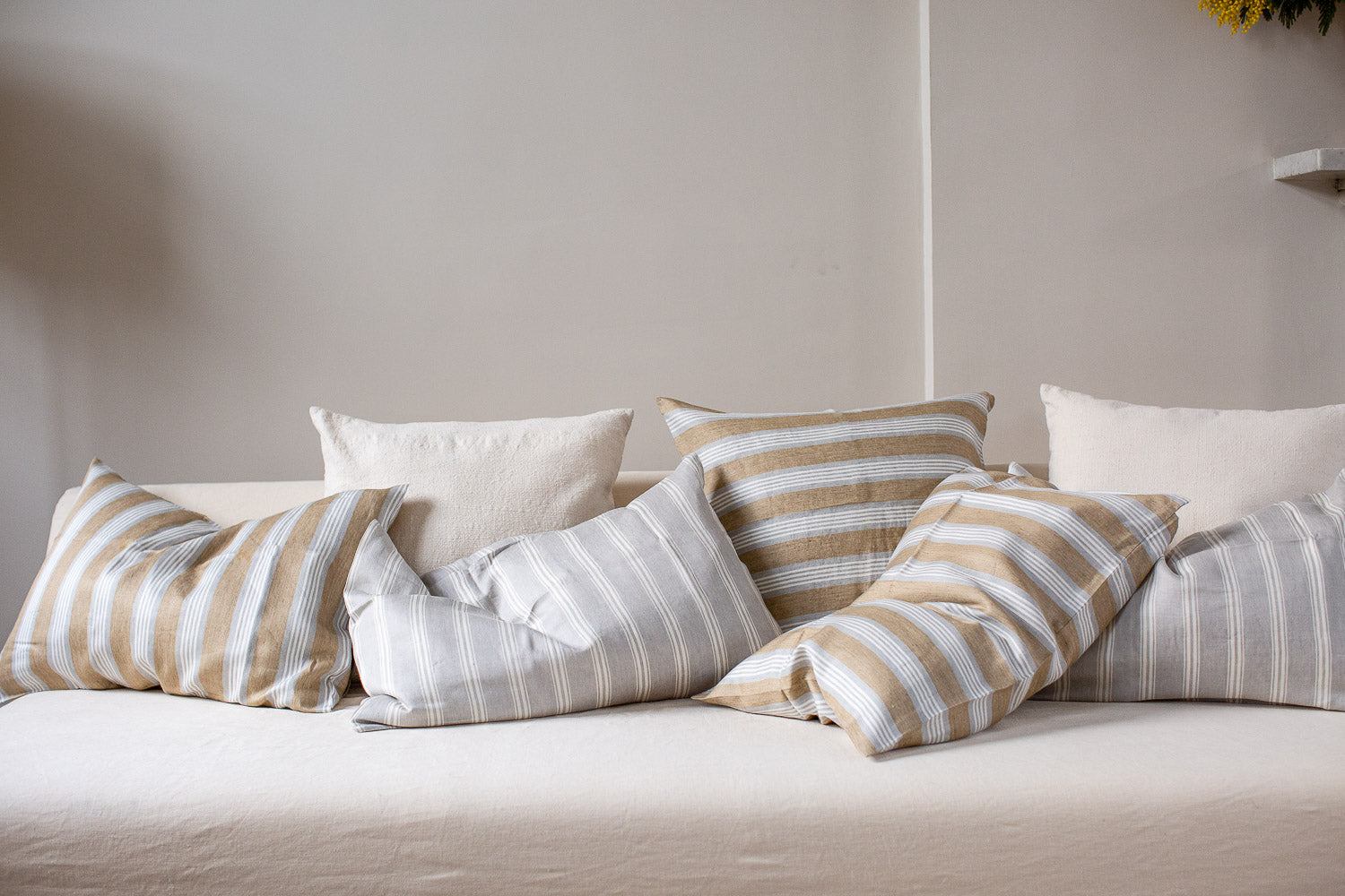

Images above show our Grey Striped Belgian Cushion Covers and Tan Striped Belgian Linen Cushion Covers, Safari Daybed, Kapok Safari Daybed Mattresses in Plain Stripes and Traditional Stripes, Handwoven Cotton Cushion Covers in Plain Stripes, Handspun Cotton Cushion Covers, Handspun Eri Silk Throw, Handmade Fluted Fruit Bowl, Classic French Table Glasses, Heritage Brass Water Mister.